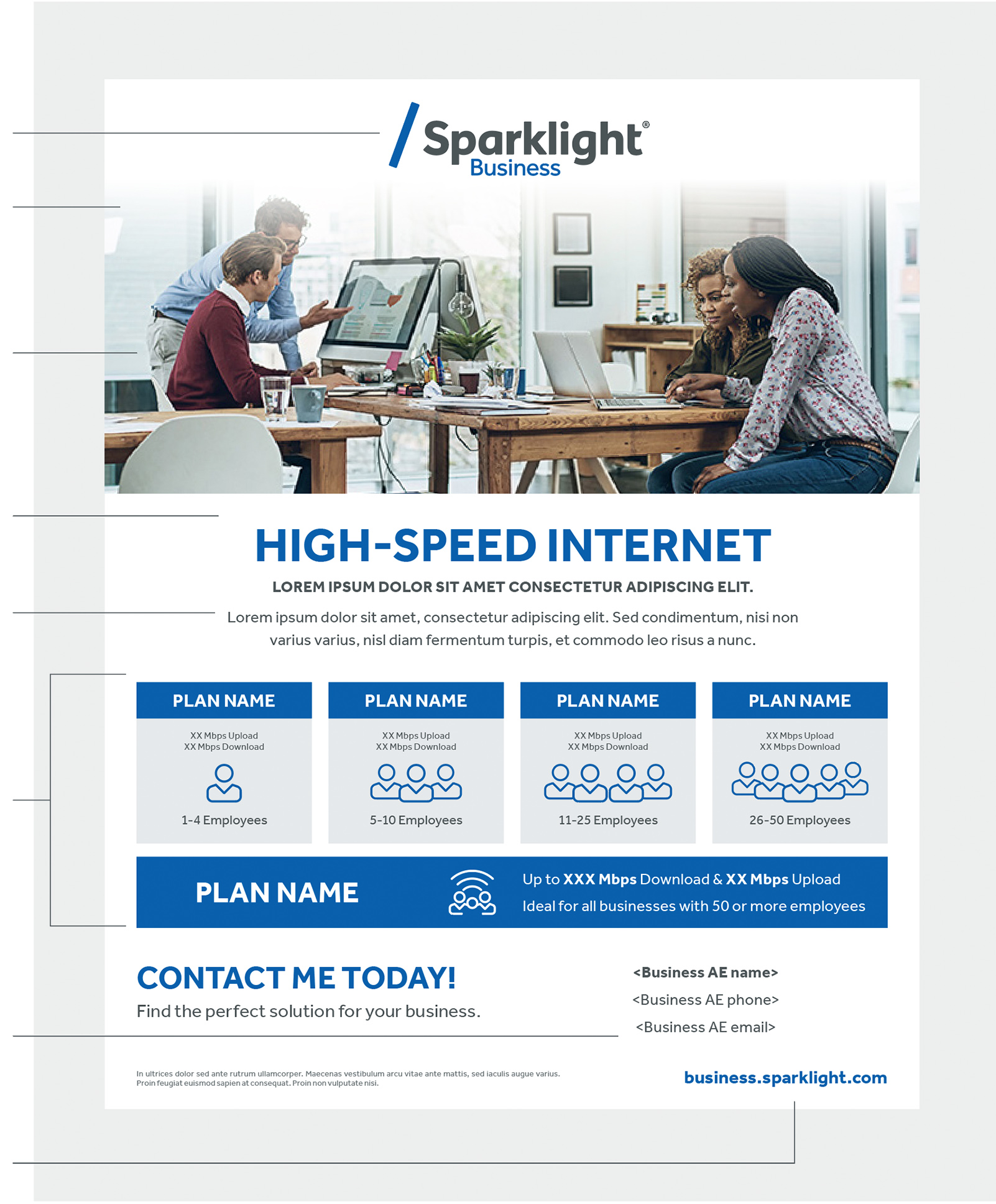
Sales Flyers
Make sure all the headlines are short enough to fit on one line.
The Sparklight Business logo, headlines, and subheads should be centered, whenever possible, on all our brand communications.
Using the appropriate weight and scale of the typeface Effra will help create dynamic layouts with strong visual hierarchy. Use the optical setting for all typography to enhance legibility.
Whenever possible, the use of icons and/or symbols should be used to reduce the amount of text and enhance the ability for messaging to be consumed quickly and aid an easy understanding.
8.5" x 11"

one line centered text Effra Regular Main body text
color Sparklight Gray Relevant ad information Contact information Business URL
